
My Role
Product Designer
Timeline
June 2025 - October 2025
Tools
Figma, Adobe Illustrator, Miro
Company
Fortem (Willmott Dixon)
Executive Summary
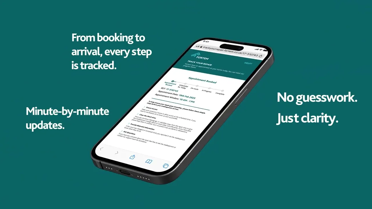
OnMyWay is Fortem’s engineer tracking tool, it was designed to show residents when an engineer is arriving at their home for a repair.
When reviewing Fortem's customer journey I highlighted the tracking tool as a weak point and I created a proposal to improve the interface. As I delved into usage data and stakeholder feedback, it became clear the root issue wasn’t just the UI, it was how the system impacted operations and customer behaviour. It had unreliable timing, vague arrival windows, and a lack of proactive updates. This was causing missed appointments and increasing call centre demand.
By repurposing the product around trust and proactive communication, I led a redesign that reduced no-access appointments by 43% and positioned the tool as a measurable commercial differentiator in client bids.
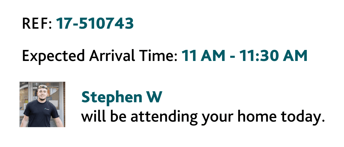
The First Impression
This message should have reassured customers that the engineer will be with them shortly.
Instead, it created uncertainty.
The tracking page showed a map, but timings didn’t reliably update. The page required a manual refresh. Arrival windows were vague, and the experience wasn’t designed for mobile, despite most residents checking from their phone.
Some called the contact centre to double-check. Others may have left their property and missed the appointment entirely.
Each missed appointment meant an engineer had to rebook, travel again, and lose productive time. Across branches, this was driving up no-access rates and creating avoidable operational cost.
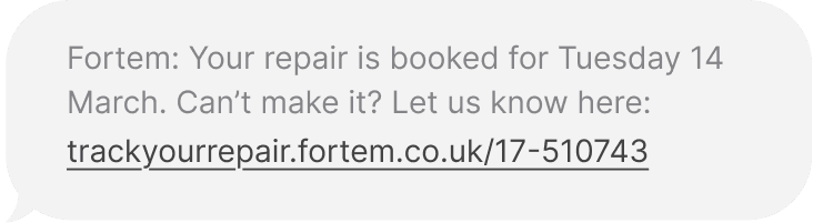
Old OnMyWay UI from Customer Perspective
STATIC STATUS
No dynamic state change or proactive update
LIMITED IDENTITY
No photo or visual
reassurance
CLUNKY UI
Old, out of date UI
styling
REFRESH DEPENDANT
Updates required manual reload of the page
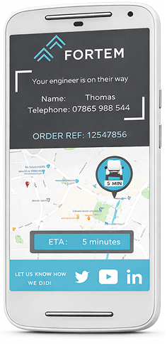
NO AUTHENTICATION
Access only required an order reference number.
UNRELIABLE ESTIMATE
Did not adjust to traffic or
delays
When Confidence Breaks
At first glance, this looked like a UI issue.
After discussions with branch managers and reviewing a high number of missed appointments, it became clear the problem ran deeper.
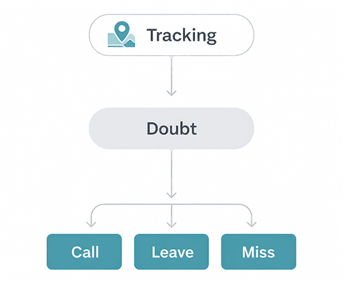
Tracking technically existed however it wasn’t reliable.
What looked like a UI problem was actually a confidence problem and that lack of confidence was directly affecting operations.
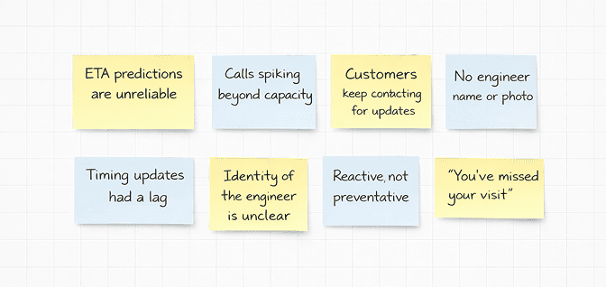
The Problem Beneath the Problem
Let's get to the route of the issue.
Rather than jumping straight into redesigning screens, I started by holding workshops with residents, branch managers, call centre teams, and operational leads to understand what was actually happening on the ground.
Some of the questions asked were:
Do residents trust the ETA?
What happens when the timing feels wrong?
Why are customers calling before an appointment?
What operational impact does a missed visit have?
Notes from Miro Whiteboard session
What we thought
Tracking refresh rate was too slow
Arrival times needed tighter accuracy
The UI felt dated
What we learnt
Uncertainty led to behaviour change
Customers didn’t trust the timing enough to plan their day
Anxiety around home visits wasn’t being addressed
Mapping out the Repair Journey
Using insights from our research, we then mapped out every stage of the repair journey, including our user's pain points and frustrations.

Having someone enter your home for a repair can cause stress and uncertainty. Repairs are about about resolving something that’s gone wrong, quickly and professionally. The objective of this design was to improve the customer’s emotional experience across the entire journey.
The lowest emotional point was just before the engineer, when customers weren’t sure if the timing was accurate or whether they could get on with their day.
From Tracking to Trust
In UX research terms, this wasn’t a simple visibility problem, it was a status and progress communication failure. In Nielsen Norman Group’s research on status indicators, they explain that progress updates only reduce anxiety when they clearly communicate “where users are in the process and what will happen next.” Simply showing activity isn’t enough.
That was exactly what was happening here.
The map technically showed movement, but it didn’t update consistently, it didn't tell residents what stage they were in, how confident the ETA was, or what would happen if timing changed. The experience provided visibility but not reassurance.
Shifting from reactive visibility to proactive reassurance.
Up to this point, most stakeholders were asking:
"How do we improve the map?"
But improving the map doesn’t help someone plan their day. It doesn’t stop them from calling support. It doesn’t reduce repeat visits.
So I reframed the question:
How do we help residents feel confident enough to plan their day around this visit, not just watch a dot on a map?
So how do I achieve this?
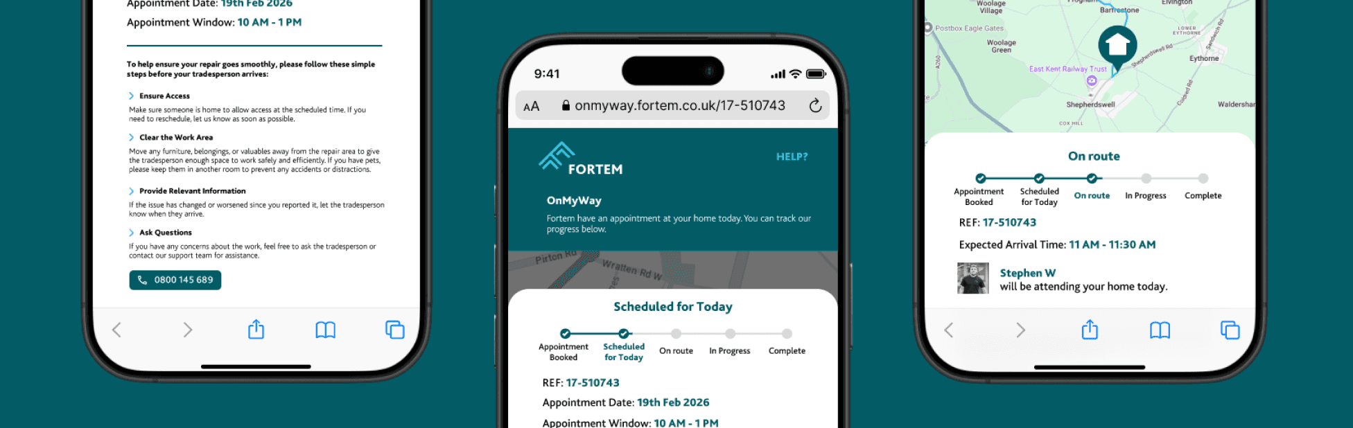
CLEAR INSTRUCTIONS
Clear messaging removed ambiguity around arrival windows, preparation steps, and next actions, reducing last-minute doubt.
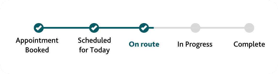
STAGES OF THE REPAIR
Introducing clear status stages helped customers understand progress, not just location.
ENGINEER INFORMATION & PHOTO
This reduced anxiety around who was arriving and strengthened safeguarding reassurance at the door.
Designing for Reassurance
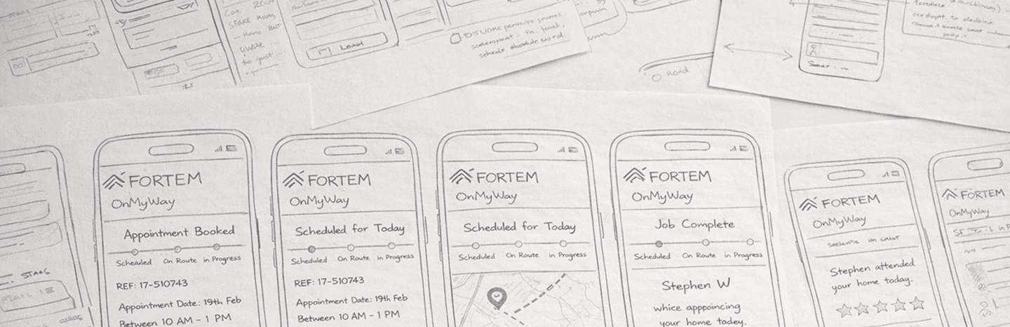
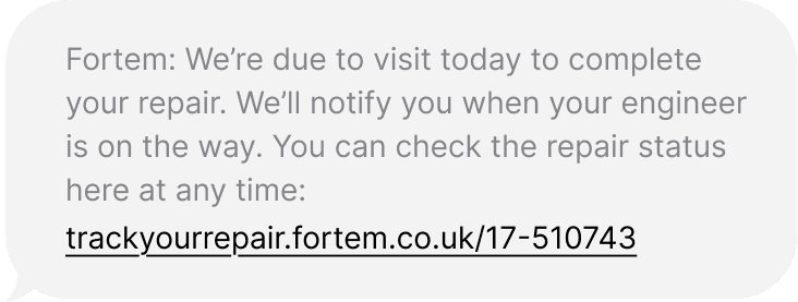
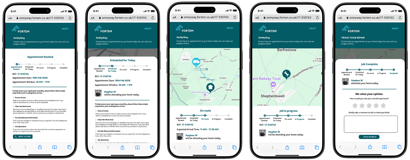
The redesigned experience introduced communication at the right moments, not just better visuals. Customers received staged text messages before and during the visit, reducing the need to check manually.
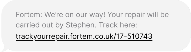
The interface was rebuilt to be mobile-first and responsive, with clearer state messaging and live updates. Engineer identity was introduced to increase familiarity and safety, reinforcing trust in who was arriving at the door.
Designing Within Constraints
Not every improvement was straightforward.
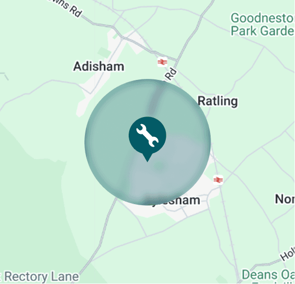
One of the most significant challenges was safeguarding. Engineers could not be tracked from their home address, and exposing precise live positioning risked revealing private residential information.
Customers needed transparency. Engineers needed protection.
To resolve this, I introduced a 1km activation buffer. Tracking would only begin once the engineer was safely away from their home location, preserving privacy while maintaining confidence.
Similarly, while stakeholders initially pushed for near real-time refresh rates, system cost and diminishing behavioural impact led me to recommend a 60-second refresh instead.
Key Design Decisions
The Results
Behaviour Changed
The redesign didn’t just look better, it changed behaviour.
Customers felt more informed and more confident in arrival times. Call centre volume related to engineer tracking reduced, and fewer customers left their property during appointment windows.
43% Reduction in No-Access Rates
Missed appointments declined significantly. Engineers completed more visits successfully, reducing repeat trips and improving operational efficiency.
Confidence became measurable.

From Feature to Product
OnMyWay evolved from a basic tracking page into a trust-building product embedded within the broader service journey.
It reduced operational cost, strengthened safeguarding standards, and became a differentiator in competitive bids. What began as a feature enhancement became a measurable commercial asset.
Business Impact
Reduced repeat visits and associated cost
Improved engineer productivity
Lowered call centre demand
Strengthened competitive positioning in bids
Reflecting on the journey
This project reshaped how I think about product design. What appeared to be a usability issue was ultimately a trust and behavioural problem.
It reinforced that great product decisions sit at the intersection of emotion, constraint, and commercial impact.
The connection between trust and performance is something I now actively design for.
Want to find out more?
I would love to know what you think or if you have any questions about this case study or any other case study on my site. Contact me on Linkedin, email me at georgegarrott.design@gmail.com or send me a message below: