


Reduced avoidable contact across capital works and retrofit programmes
My Role
Product Designer / Developer
Timeline
October 2024 - April 2025
Tools
Figma, Adobe Illustrator
Company
Fortem (Willmott Dixon)
Executive Summary
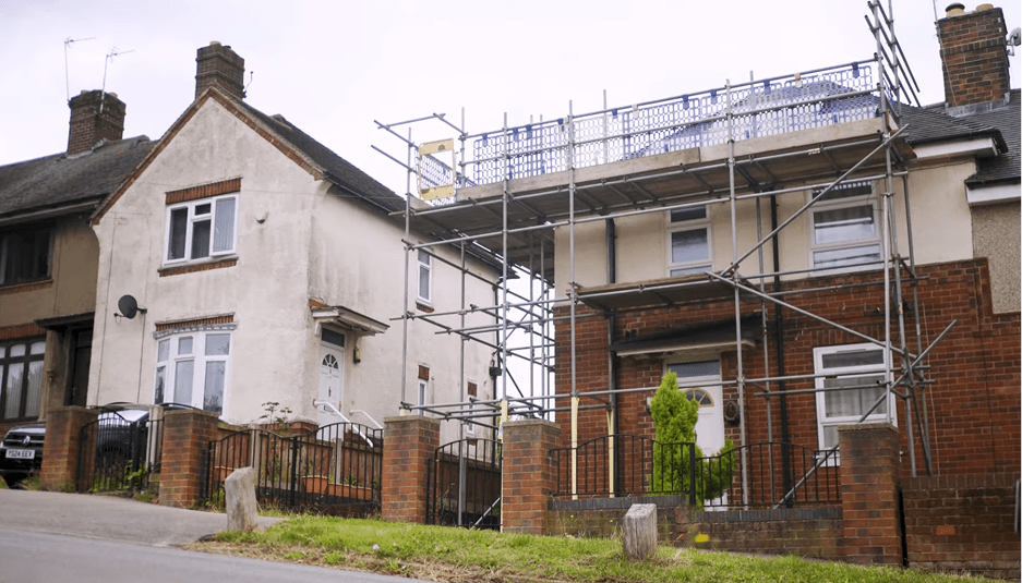
Fortem is a UK property services provider delivering repairs, maintenance, retrofit, and capital works programmes on behalf of housing associations and local authorities. As part of these major works projects, residents require clear communication about what will happen in their homes and when.
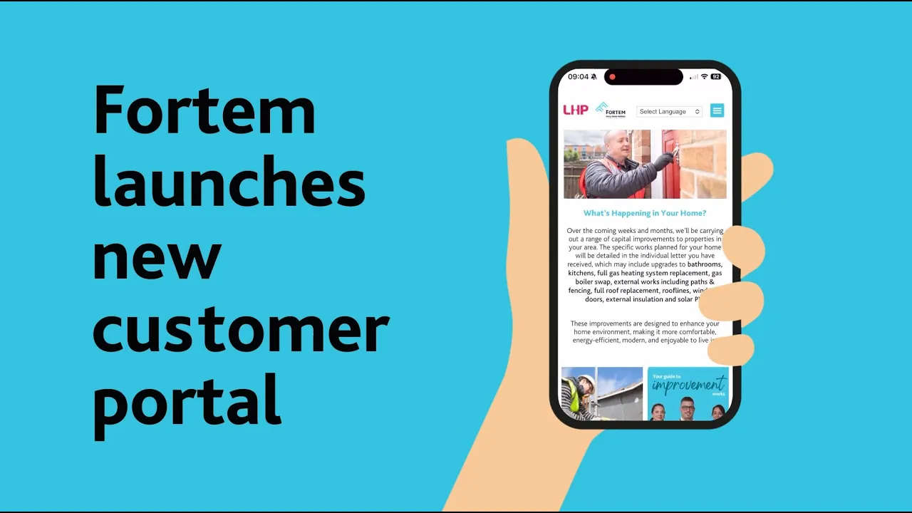
Fortem’s Customer Portal was originally built as a static information site, but engagement was low and it failed to reduce resident uncertainty or operational pressure.
My Role
I identified a broader opportunity to rethink how we communicated across contracts. I led the strategy, design, and build of an in-house, scalable portal framework that improved communication and reduced avoidable resident contact. It has now been rolled out across all client contracts.
The Initial Proposal
We were presented with an off-the-shelf resident app.
On paper, it solved the problem. It included updates, notifications, and templated communication pages. It ticked the boxes.
But it didn’t feel right.
It didn’t reflect how we delivered major works programmes. It didn’t match our processes. And it wouldn’t scale cleanly across clients without ongoing cost and limitation.
That moment forced a bigger question:
Did we really need another external tool or did we need to rethink how we communicated altogether?
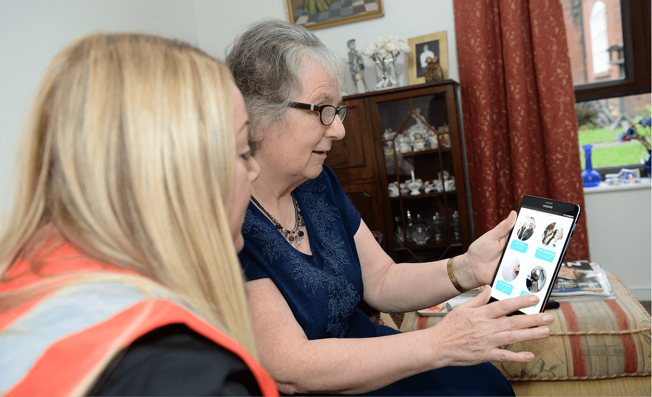
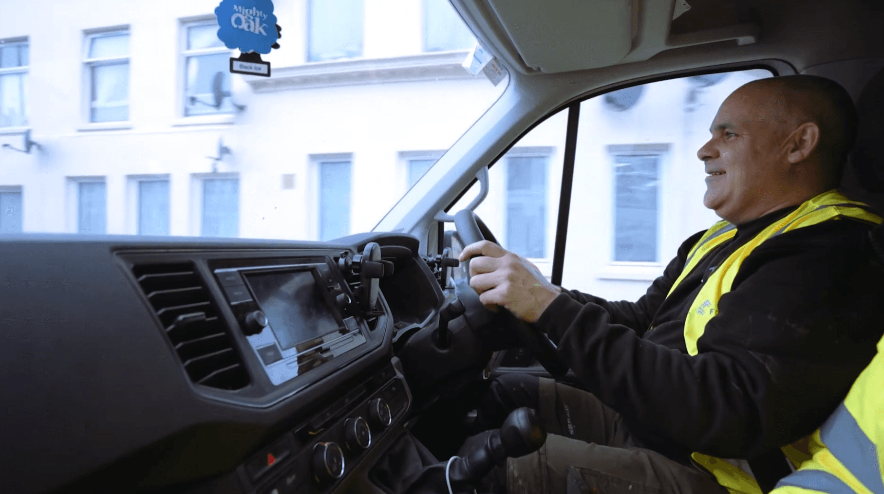
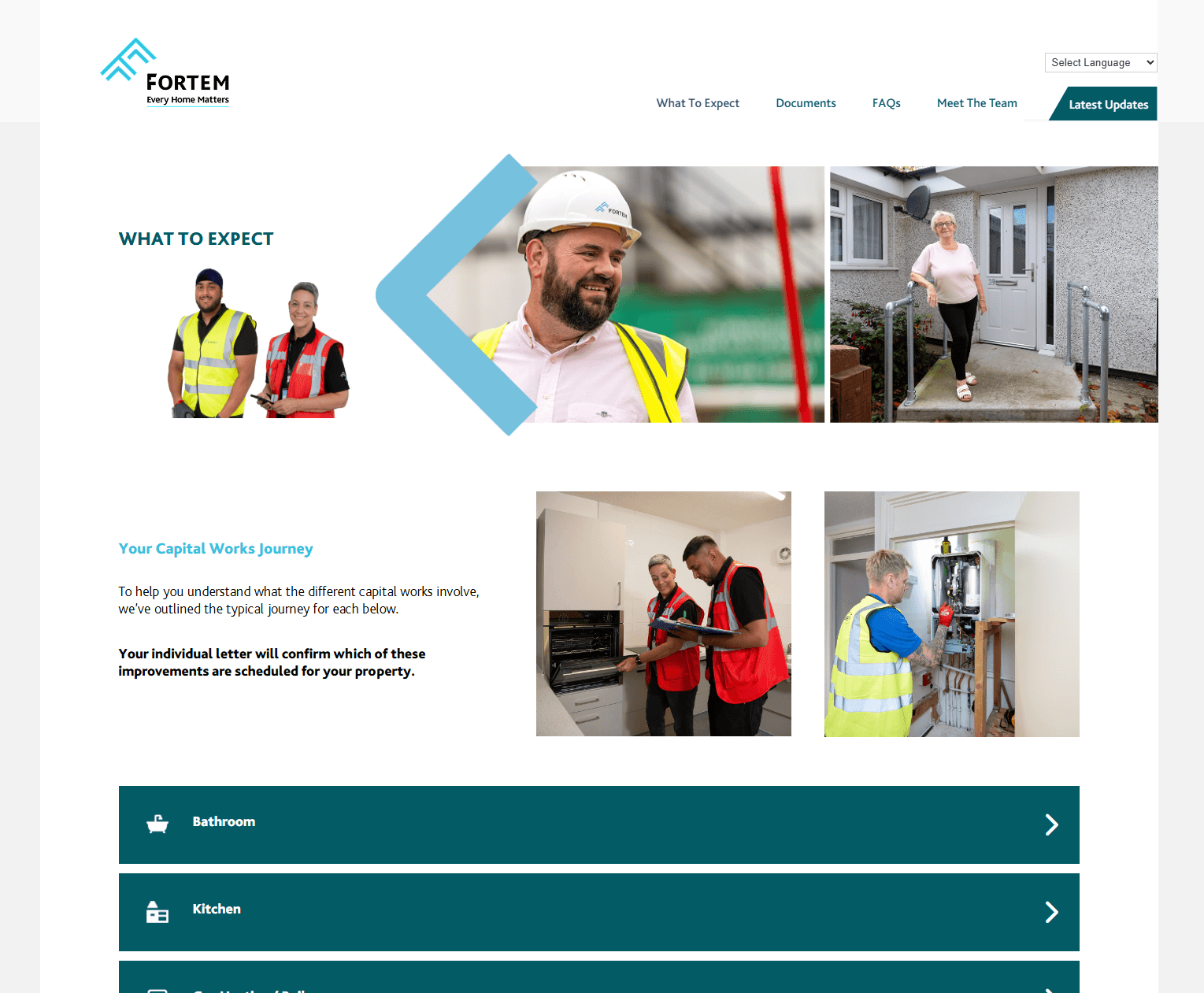
Resident using existing Customer Portal
Understanding Our Customer
After the meeting with the external provider, I informed the directors that I believed we could build something better in-house, something shaped around how our programmes actually ran, not around a template.
They agreed to let me explore it further.
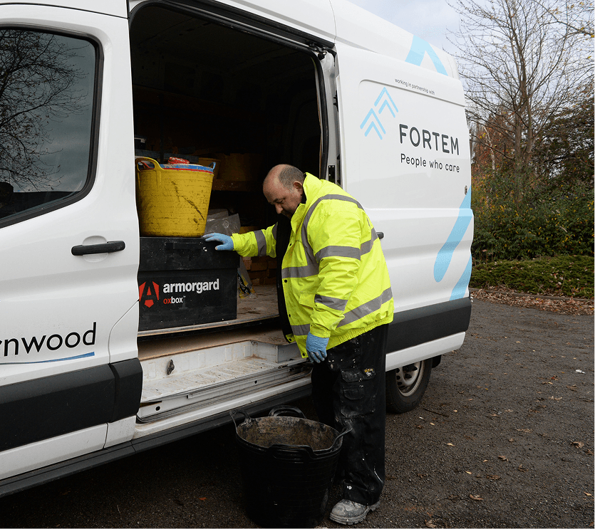
But before designing anything, I stepped away from screens and spent some time with engineers visiting customers.
I spent three days across three different branches in the UK, travelling with engineers in their vans and visiting residents during active capital works and retrofit projects. I wanted to understand the experience from all sides.
Early Insights from the Field
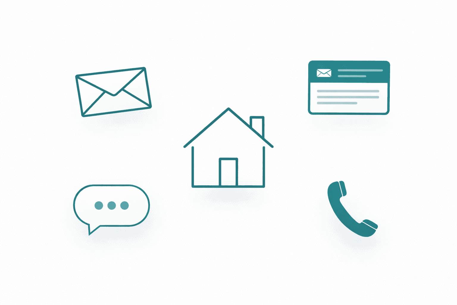
Information Was Fragmented
Residents were receiving updates through letters, emails, phone calls, and conversations at the door but nothing tied it together.
Engineers Repeating Answers
On site, engineers would have to regularly answer the same basic questions before work even began.
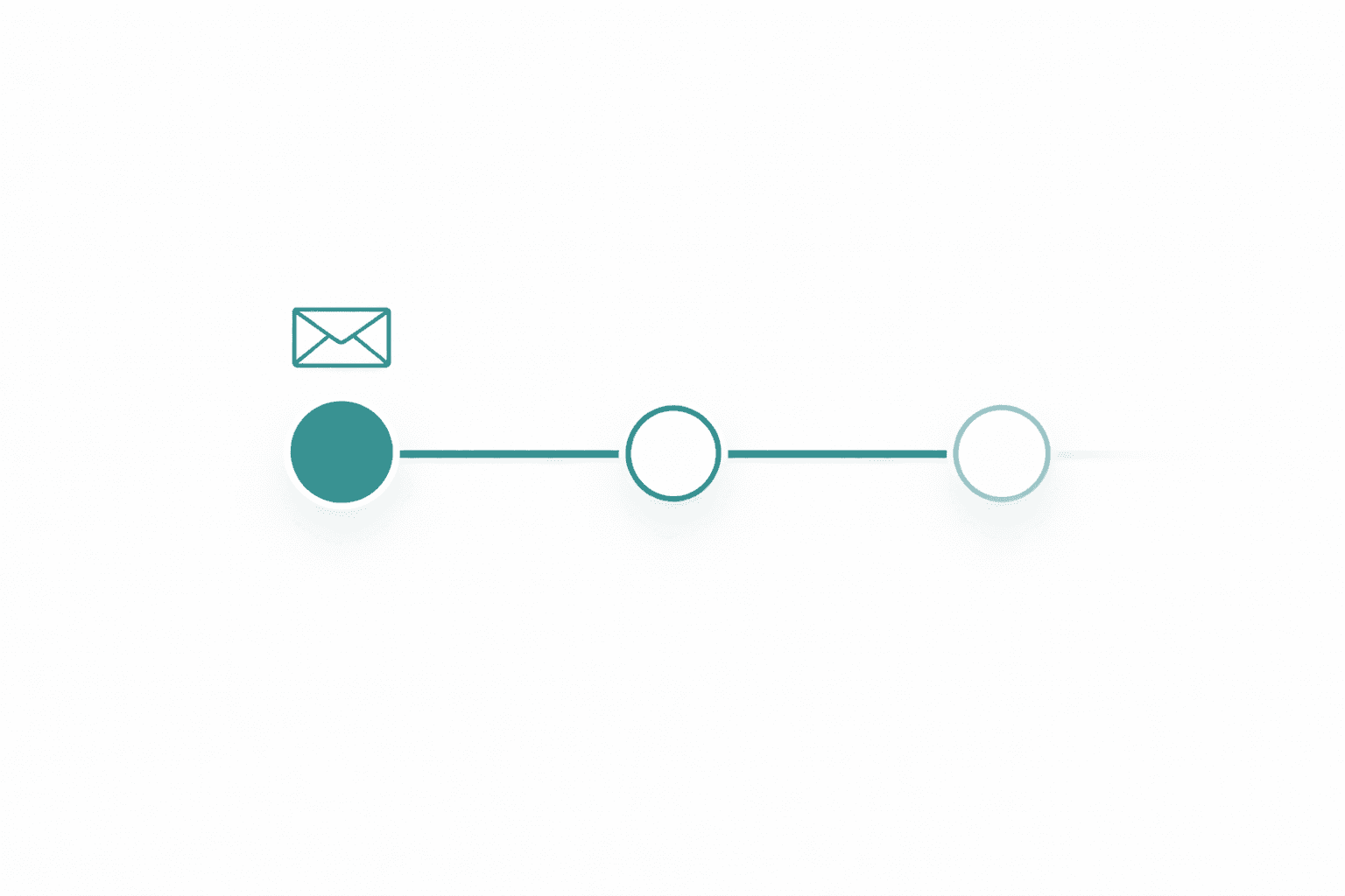
Updates Weren’t Evolving
After the initial letter, communication often stalled. If timelines shifted or details changed, residents didn’t always have a live reference point to check.
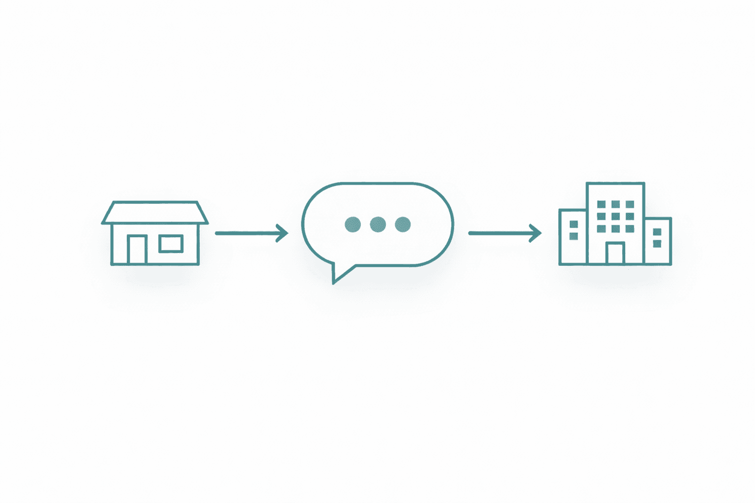
There Was No Clear Ownership
The existing portal included a contact form, but it didn’t consistently route to the right team. In some cases, messages went unanswered.
What became clear during those three days was that the real issue wasn’t design quality. It was continuity.
Residents needed a single, reliable place that reflected the live status of their works.
Bringing It Together
After returning from the field visits, I organised a cross-functional workshop to present what I’d observed and define what the portal needed to become.
In the room were colleagues from Marketing, Customer Experience, Customer Liaison Officers across branches, and resident group leaders. The goal was to align on the real communication gaps.
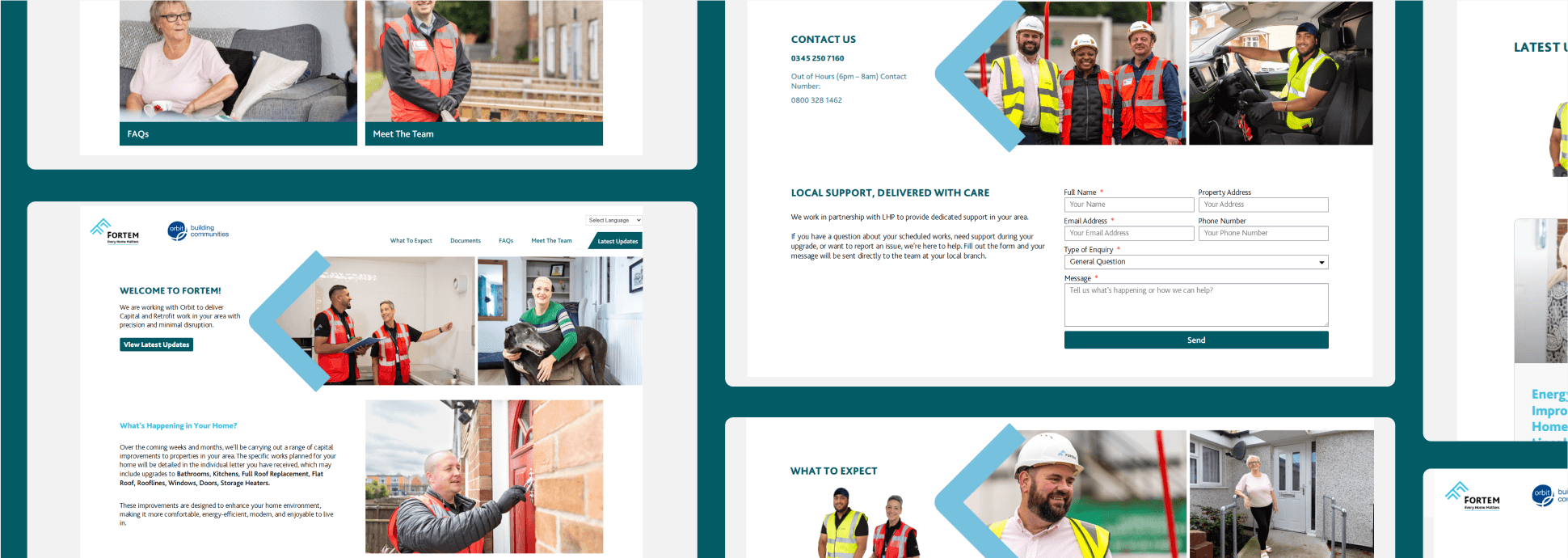
Together, we captured everything stakeholders felt was important from document hosting and FAQs to live updates, team contact details, testimonials, translation support, and structured “latest news” sections.
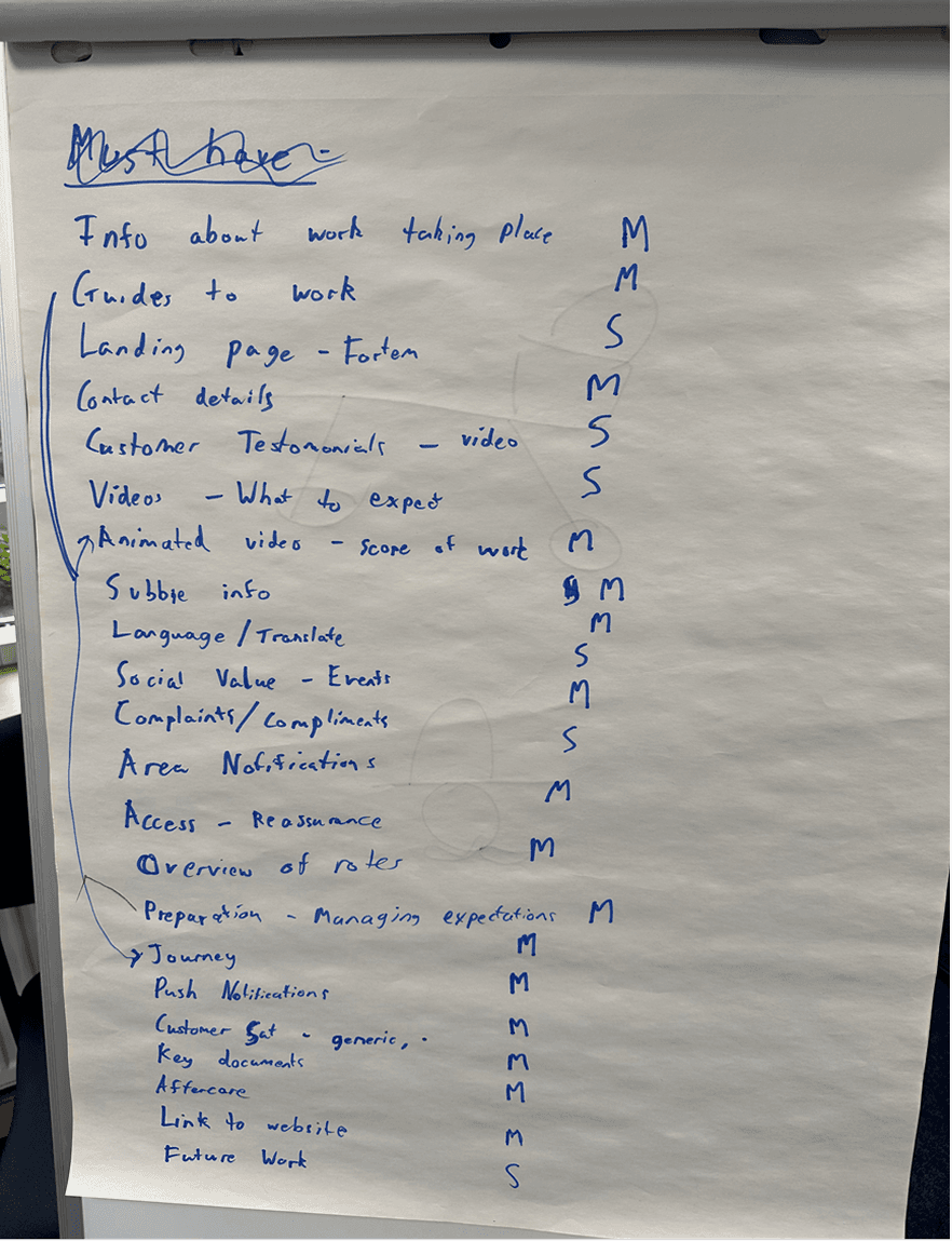
We mapped and prioritised the key features the portal would need in order to genuinely reduce confusion and operational strain.
We focused on functionality that would directly reduce confusion, improve clarity, and scale across contracts rather than building a feature-heavy site that looked impressive but didn’t solve operational strain.
Once the core features were agreed, we stepped back and looked at the wider context.
Features alone wouldn’t fix the problem unless they aligned to the real journey residents were experiencing during capital works and retrofit projects.
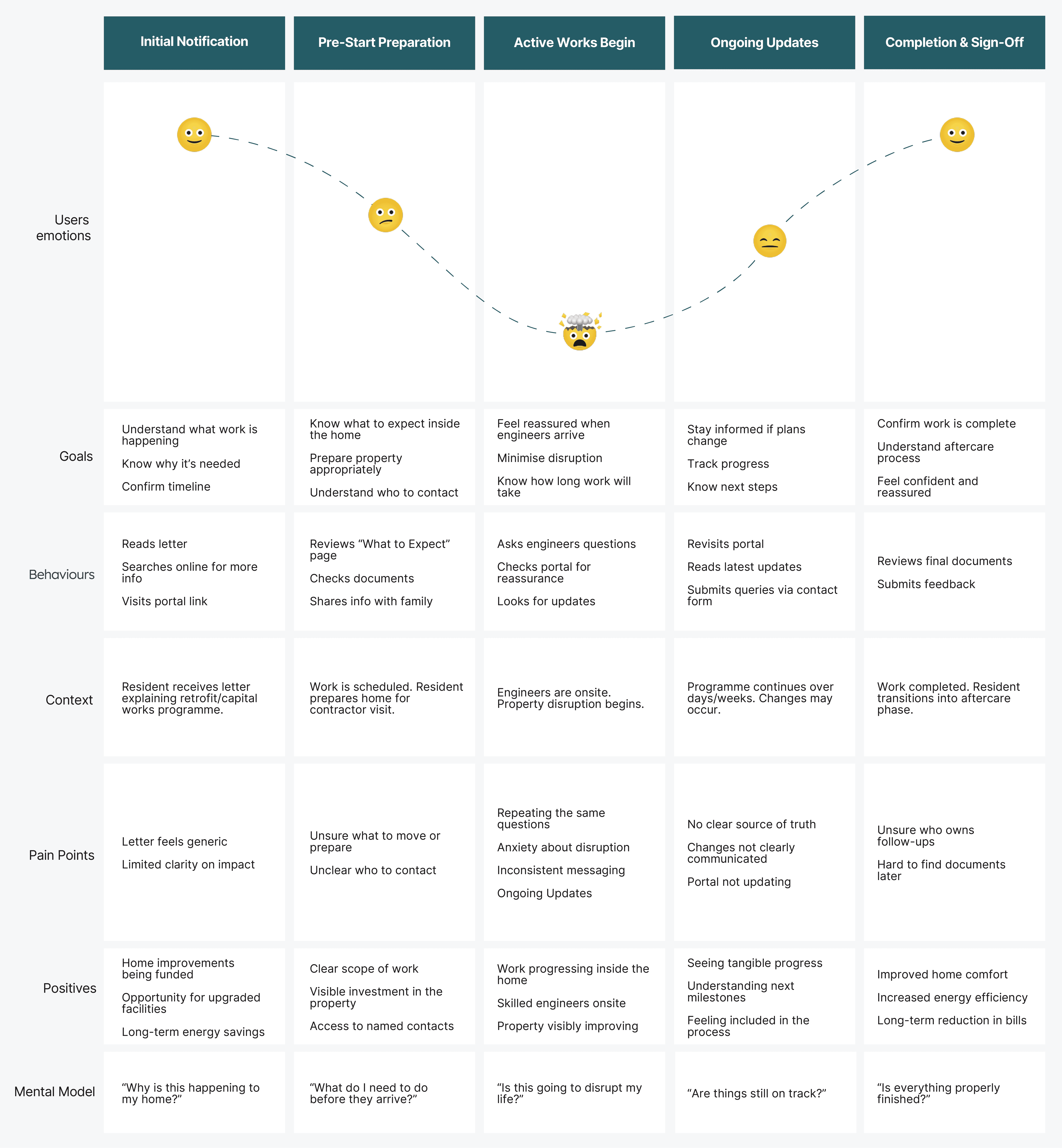
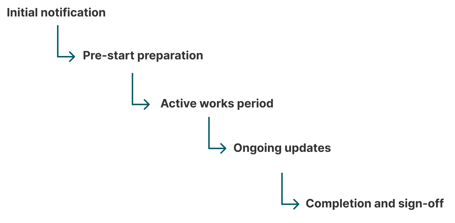
In the second phase of the workshop, we mapped the resident journey from the moment they were notified of upcoming works through to completion. We identified key touchpoints:
For each stage, we discussed:
What questions residents typically ask?
What information is currently sent?
Where confusion occurs?
When contact volumes spike?
By overlaying the prioritised features onto this journey, we could see where the portal needed to intervene.
From Strategy to Structure
Once the core features were prioritised and mapped against the resident journey, I moved into low-fidelity wireframing.
Before starting the design in Figma, I sketched rough layouts for each key page by hand. I wanted to think through structure and hierarchy without getting distracted by colour, branding, or visual polish.
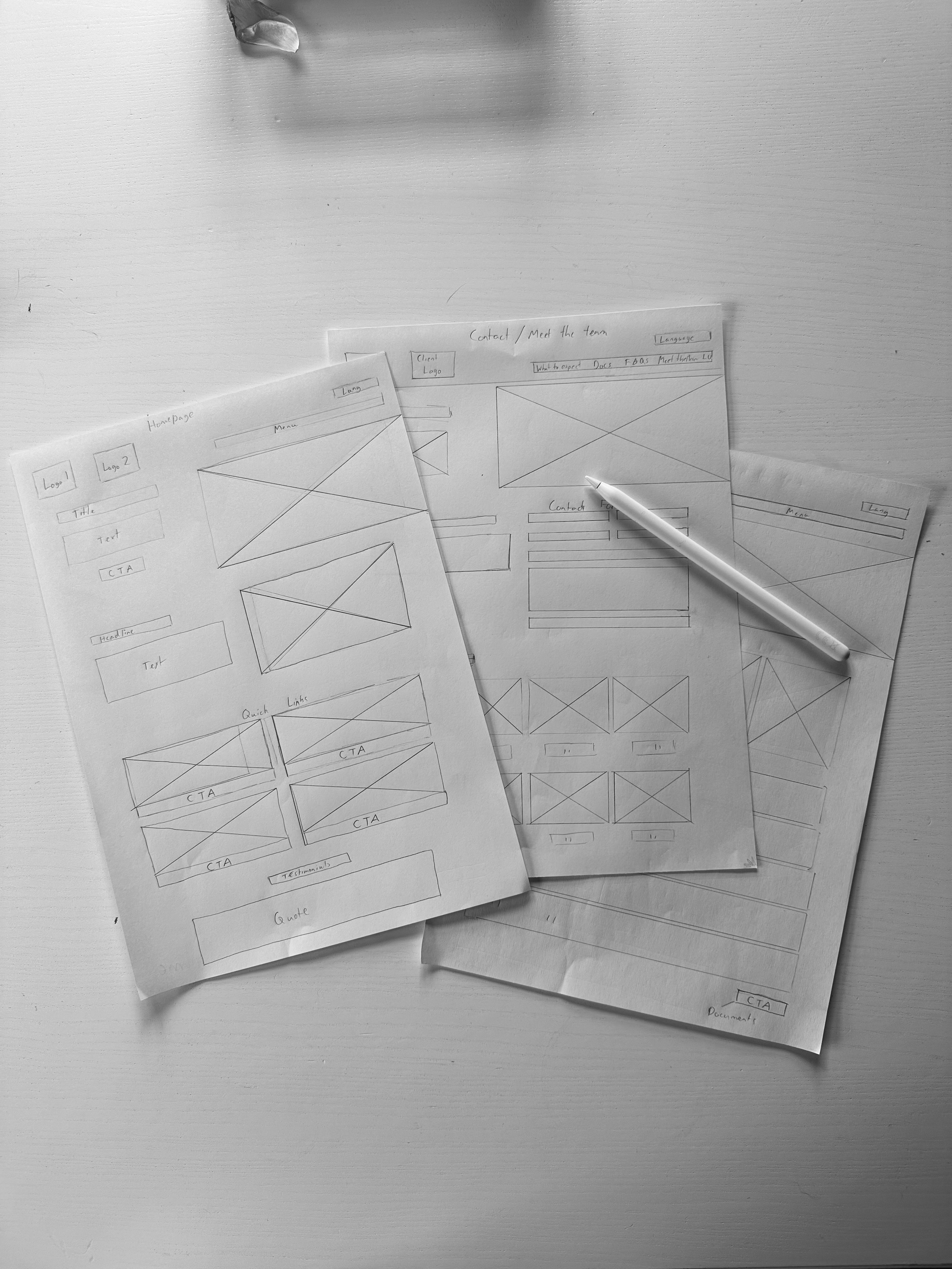
Once the structure felt clear, I translated the sketches into wireframes in Figma. This allowed me to validate navigation flow, content grouping, and page relationships before layering in branding and visual design.

Repeatable by Design
Designing ... and Delivering
Once the wireframes were validated, the next challenge was technical delivery.
At the time, we didn’t have in-house engineering resource available to build a bespoke portal platform. Rather than pause the project or outsource it, I proposed building the first version myself.
I chose WordPress deliberately, not because it was the most complex solution but because it was the most practical one.

A key insight from the workshops was that the old portal failed partly because content became static. If updates were difficult, they simply didn’t happen. WordPress allowed CLOs and marketing teams to post updates, news, and documents without relying on developers.


One critical improvement was how resident enquiries were handled.
The previous portal included a generic contact form, but submissions didn’t consistently reach the right team and were sometimes overlooked. To prevent this, I designed the form submissions to integrate directly with our call centre platform, Talkdesk. Instead of sending emails into shared inboxes, enquiries were automatically routed into the appropriate queue within the system, ensuring accountability and response tracking.
This meant the portal wasn’t just reducing calls, it was improving how the remaining contact was managed.
The Results
The redesigned portal didn’t introduce entirely new information it changed how and when that information was delivered.
By structuring content around the resident journey, simplifying updates, and embedding clear ownership, the portal began to reduce avoidable contact and support programme delivery more effectively.
Across the first live contracts:
Resident calls relating to “what happens next?” reduced during key phases of works
Portal revisit rates increased as updates became structured and timely
The framework was successfully duplicated across 8 client contracts
Business Impact
Lowered avoidable contact volumes across retrofit programmes.
Positioned Fortem with an in-house communication product to strengthen contract bids.
Replaced dependency on third-party app providers with a scalable internal solution.
Reflecting on the journey
I fully owned the product from research through to live rollout across multiple contracts. It required stepping beyond interface design and thinking about operational flow, content governance, and scalability.
It strengthened my confidence in challenging assumptions, proposing alternatives, and delivering pragmatic solutions when resources were limited.
Want to find out more?
I would love to know what you think or if you have any questions about this case study or any other case study on my site. Contact me on Linkedin, email me at georgegarrott.design@gmail.com or send me a message below: